A fitness logo sets the foundation for a strong brand. The right one grabs attention, builds recognition, and creates a lasting impression. For personal trainers, gyms, and fitness businesses, a well-designed logo signals professionalism and trust. Clients should instantly connect your logo with strength, movement, and motivation.
If you’re searching for fitness logo ideas, you’re in the right place. According to Forbes, Logos play a bigger role in branding than most people realize. 75% of consumers recognize a brand by its logo, proving how powerful a great design can be. Think about Nike’s swoosh or Gold’s Gym’s classic emblem — both simple, memorable, and built for impact.
Creating the right logo takes more than just picking a font or symbol. The right colors, shapes, and styles make all the difference. This guide covers:
- How to create a fitness logo (best tools & resources)
- Fitness logo ideas & inspiration (real-world examples)
- Design tips & best practices (colors, fonts, and branding advice)
Let’s break it down step by step.
Contents
- The importance of a good logo for your fitness business
- Best fitness logo tools & generators
- What type of fitness logo works best?
- What’s the best logo style for your fitness business?
- How to design a memorable fitness logo
- Fitness logo examples
The importance of a good logo for your fitness business
As human beings, whether we admit it or not, we make judgments based on first impressions. Consider two CVs: one crumpled and coffee-stained, the other pristine in a clear plastic wallet—you instinctively favour the latter, regardless of experience. A logo has the same effect on customers.
A logo is the foundational element of a company’s branding strategy. It should be unique and comprehensible to a potential customer.
- A well-designed logo implies professionalism. It could make the difference between choosing your business and another with a substandard logo.
- A logo is part of a larger brand identity, integrating fonts, colours, and document design.
- Many fitness logos lean on clichéd imagery—dumbbells, weight plates—but standing out matters. Creative alternatives like an animated bobble‑head or cartoon version of yourself can be more recognisable and memorable.
Key principles of a good logo
- Follow basic design principles: consider space, form, consistency, clarity, and colour.
- Ensure functionality: It must stand out and adapt across various backgrounds and mediums; special effects may not render well everywhere.
- Be unique: A logo needs to stand out, or it risks being forgotten.
To avoid damaging credibility, avoid low-quality logos that look cheap, generic or clip-arty. Give your branding your own unique spin, this will help you stand out, look more professional, and increase reliability.
Before you start designing, it’s worth spending time choosing your personal training business name, as the two should work together to build a cohesive brand identity from the ground up.
Best fitness logo tools & generators
Creating a fitness logo doesn’t have to be complicated or expensive. Plenty of online tools make it easy to design a personal trainer logo that looks professional, even without graphic design experience. From AI-powered generators to fully custom designs, here are the best fitness logo makers to bring your brand to life.
1. Canva – Easy DIY logo maker
Canva is a great choice for personal trainers and small gym owners who want full control over their logo design. It offers a massive library of fitness logo templates, drag-and-drop editing, and customization options for fonts, colors, and icons. Canva is free to use, but premium elements and branding features are available with Canva Pro.
2. Looka – AI-powered logo design
Looka uses artificial intelligence to generate logo options based on your industry and style preferences. After answering a few questions, Looka creates multiple fitness logo ideas that can be tweaked and refined. This tool is perfect for those who want a sleek, modern logo with minimal effort.
3. Tailor Brands – Logo maker + branding suite
Tailor Brands goes beyond logos by offering a full branding toolkit, including business cards, social media assets, and a website builder. Its AI-driven generator creates personal training logos in minutes, making it ideal for trainers who want a cohesive look across all marketing materials.
4. 99Designs – Custom logos from freelancers
For a unique, high-quality logo, 99Designs runs design contests where multiple freelance designers submit custom concepts. You pick your favorite and work with the designer to refine it. This option is best for gym owners or fitness brands looking for a one-of-a-kind logo with a professional touch.
5. DesignCrowd – Crowdsourced logo concepts
Similar to 99Designs, DesignCrowd lets you post a design brief and receive multiple submissions from designers worldwide. It’s a great way to compare different styles and get a custom gym brand logo without hiring a full-time designer.
6. Squarespace Logo Maker – Simple, sleek logos
If you need a clean, minimalist logo, Squarespace Logo Maker provides a straightforward solution. It’s ideal for trainers and boutique fitness studios that prefer a modern, professional look with minimal design effort.
7. Placeit – Instant templates for social media & branding
Placeit offers fitness logo templates tailored for social media, apparel, and merchandise. It’s a great choice for influencers, online coaches, or fitness brands that want a polished logo for Instagram, YouTube, or branded workout gear. This will help set you up for social media marketing success!
Choosing the right tool
- On a budget? Canva and Squarespace Logo Maker offer free options.
- Want AI-powered convenience? Looka or Tailor Brands do the work for you.
- Need a unique, custom design? 99Designs and DesignCrowd bring in professional designers.
- Focusing on social media branding? Placeit has ready-made templates for content creation.
No matter which tool you choose, the key is to create a fitness logo that represents your brand’s identity, energy and mission. Take your time, experiment with different styles, and build a logo that leaves a lasting impression.
For a custom-branded fitness app, discover My PT Hub’s special tool that will combine everything, not just your logo, just for you.
What type of fitness logo works best?
Not all fitness logos look the same. The right style depends on your brand personality, target audience, and where you’ll use the logo. Here’s a breakdown of different logo types, along with recommendations on what works best for personal trainers, gyms, and fitness brands.
1. Wordmark (Text-based logos)
A wordmark logo is a clean, typography-based design that focuses on the business name. These logos work best when the name itself is strong and memorable.
✔ Best for: Established brands, boutique studios, and personal trainers.
✔ Examples: Gold’s Gym, Nike, Peloton.
2. Lettermark (Initial-based logos)
A lettermark logo (also called a monogram) is a minimalist design using initials instead of a full brand name. This works well for businesses with long names that want a sleek, modern look.
✔ Best for: Large gym chains, corporate wellness brands, and high-end fitness studios.
✔ Examples: LA Fitness, Equinox, UFC.
3. Pictorial Mark (Symbol-only logos)
A pictorial mark is an image-based logo that represents the brand without any text. This style works best for well-known brands or those looking to build a strong visual identity over time.
✔ Best for: Large gyms, fitness tech brands, and supplement companies.
✔ Examples: Apple (MyZone uses a heart rate symbol), Under Armour.
4. Abstract logo mark (Geometric or conceptual designs)
Abstract logos use unique shapes and symbols rather than literal images. These logos can be powerful for fitness brands that want a distinct, modern look with deeper meaning.
✔ Best for: High-performance fitness brands, strength & conditioning coaches, and innovative fitness technology.
✔ Examples: Nike Swoosh, Hyperice, Adidas.
5. Mascot logos (Character-based logos)
Mascot logos feature an illustrated character that embodies the brand’s energy and personality. This style can be fun, engaging, and memorable, making it great for social media branding.
✔ Best for: Strength training brands, bodybuilding coaches, and fitness influencers.
✔ Examples: Bodybuilding.com Gorilla, MusclePharm’s Combat series.
6. Combination mark (Text + symbol)
A combination mark blends text with a graphic or icon, making it one of the most versatile logo styles. This type of fitness logo ensures brand name visibility while incorporating a strong visual identity.
✔ Best for: Personal trainers, online coaches, boutique studios, and fitness brands looking for versatility.
✔ Examples: Fit Queen, Evolution Nutrition.
7. Emblem logos (Text inside a symbol)
An emblem logo has text embedded within a symbol or badge. These logos often carry a premium or classic feel, making them ideal for established fitness brands with a strong heritage.
✔ Best for: High-end gyms, premium fitness brands, and traditional training institutions.
✔ Examples: Power Plate, Harley Davidson, Harvard’s crest.
What’s the best logo style for your fitness business?
- Personal trainers & online coaches → Combination Mark or Wordmark (versatile, professional).
- Gyms & fitness studios → Pictorial Mark or Abstract Logo (modern, recognizable).
- Yoga & pilates studios → Minimalist Wordmark or Abstract Symbol (clean, calming).
- Strength & bodybuilding coaches → Bold Lettermarks or Pictorial Marks (strong, impactful).
A well-designed personal trainer logo should reflect your brand’s personality and work across all platforms, from social media to merchandise. Choose a style that aligns with your brand vision, and make sure it’s scalable, versatile and memorable.
How to design a memorable fitness logo
A fitness logo should be eye-catching, unique, and instantly recognizable. The right design communicates what your brand stands for and creates a lasting impression. Here’s how to craft a logo that stands out and connects with your audience.
Represent your brand identity
Every fitness business has a different personality, and your logo should reflect that. Make a logo that represents you, your brand, training style and customer base. Colors, fonts, and imagery all play a role in telling your brand’s story.
✔ Strength & bodybuilding brands → Bold fonts, dark colors, and sharp lines (e.g., black, red, metallic tones).
✔ Yoga & pilates studios → Soft curves, natural colors, and minimalist designs (e.g., blue, green, beige).
✔ HIIT & CrossFit gyms → Energetic, dynamic fonts with high-contrast colors (e.g., red, orange, yellow).
✔ Luxury personal training → Sleek, modern fonts with neutral or premium tones (e.g., black, white, gold).
Before designing your logo, take a look at competitors in your niche. Identify what works and think about how you can create something fresh and unique.
How to avoid cliché fitness design mistakes
Some fitness imagery is overused—dumbbells, flexed biceps, heartbeat lines. While these symbols clearly relate to fitness, they don’t make your brand stand out unless they’re done in a unique way.
✅ How to put a fresh twist on common imagery:
- Combine fitness symbols with abstract shapes or sleek typography.
- Use negative space to incorporate hidden elements.
- Opt for minimalist, modern interpretations rather than generic clipart.
- Choose a color scheme that sets you apart from competitors.
A strong fitness logo should feel fresh, distinctive, and aligned with your brand’s identity.
The psychology of colors in fitness logos
Colour and typography are two of the strongest visual tools in branding. The right combination can influence how your audience feels about your business, while reinforcing your fitness niche.. Different colors evoke different emotions, so choosing the right palette can help shape how your audience perceives your brand. The color red, for example, is said to provoke strong emotions such as passion, anger, and excitement. While different fonts evoke different aesthetics.
| Meaning / Impression | Colors | Fonts | Best for |
| Power, energy, action | 🔴 Red | Strong, bold fonts (Impact, Oswald) | CrossFit, HIIT, weightlifting, high-performance brands |
| Calm, trust, professionalism | 🔵 Blue | Handwritten or soft fonts (Quicksand, Lora) | Yoga, holistic wellness, personal training |
| Strength, luxury, exclusivity | ⚫ Black | Sleek, modern fonts (Montserrat, Helvetica) | Premium coaching, high-end studios |
| Health, nature, balance | 🟢 Green | Handwritten or soft fonts (Lora, Quicksand) | Plant-based fitness, recovery, longevity |
| Enthusiasm, motivation, friendliness | 🟠 Orange | Bold yet modern fonts (Oswald, Montserrat) | Group training, fitness influencers |
| Positivity, energy, youthfulness | 🟡 Yellow | Rounded or approachable fonts (Quicksand, Montserrat) | Family fitness, beginner-friendly programmes |
Keep it simple & versatile
A good fitness logo should be simple enough to be memorable but versatile enough to work across all platforms—social media, merchandise, gym signage, websites, and even app icons.
✅ What makes a logo versatile?
- Clear and recognizable at any size.
- Looks great in color and black-and-white.
- Works on digital and print materials.
Some of the most effective fitness logos use minimal elements while still being bold and impactful. Focus on clarity, simplicity, and brand alignment to create a design that stands the test of time.
Real-life fitness logo examples & inspiration
A well-designed fitness logo makes a brand instantly recognizable. Below are real-world examples of personal trainers, gyms, studios, and fitness brands with logos that effectively capture their identity.
Personal trainer logos
Ellie Rose Fitness – Strong color branding for women’s fitness
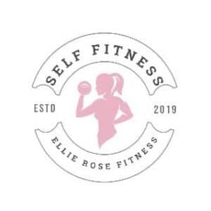
Ellie Rose Fitness uses a combination mark with clean typography and a soft yet bold pink hue. The color choice signals a focus on women’s health and empowerment, while the simple design keeps it professional and easy to recognize.
Sam Bird Physique Coach – Simplicity & authority in branding
This wordmark logo relies on a bold, no-nonsense font with a strong red accent. The color psychology of red evokes intensity and power, making it an excellent choice for a physique coach.
Fit Queen – Creative branding with a unique visual element
Fit Queen’s logo blends a modern font with a crown symbol, reinforcing the brand’s identity as a female-focused fitness business. The logo is clean, memorable, and empowering—a great example of how a subtle icon can elevate a simple design.
Gym & studio logos
Greatest Physiques – Community-driven branding
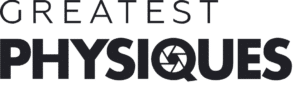
This combination mark integrates a pictorial element within the text, emphasizing community and collective progress. The bold font ensures visibility across digital and print platforms, making it ideal for a fitness brand with a strong online presence.
F45 – A strong color identity with franchise appeal
F45’s lettermark logo is clean and bold, with a strong blue, white, and red color scheme that reinforces trust, energy, and professionalism. The simplicity of the design ensures it remains effective across all marketing materials, from gym signage to workout gear.
Equinox – Premium & minimalist branding
Equinox uses a sleek, all-caps wordmark that aligns with its high-end, luxury fitness brand. The monochrome color scheme conveys exclusivity, making it perfect for premium gyms and personal training studios.
Yoga & holistic fitness logos
Lululemon – Minimalist with a strong brand presence
Lululemon’s abstract logo is simple yet recognizable, making it a standout example of how a minimalist mark can become iconic. The brand’s use of red conveys energy, while the fluid shape reflects movement and balance.
Y7 Yoga – Bold, modern, and trend-focused
Y7 Yoga uses a monochrome, minimalist design that feels modern and urban. The bold, all-black aesthetic sets it apart from traditional soft, pastel yoga branding, appealing to a younger, trendier demographic.
Nutrition & supplement brand logos
Evolution Nutrition – Smart use of DNA-inspired branding
Evolution Nutrition incorporates a pictorial mark resembling a DNA strand, reinforcing its science-backed approach to fitness supplements. The simple font ensures clarity, while the blue color adds a sense of trust and reliability.
Myzone – Vibrant, engaging, tech-driven design
Myzone’s logo integrates multiple colors, reflecting its interactive, heart-rate-based fitness technology. While more visually complex, the balance between text and imagery makes it engaging and dynamic, matching the brand’s high-energy identity.
Key takeaways from successful fitness logos
✔ A simple, clean design is more memorable and versatile.
✔ Strong typography and color choices reinforce brand identity.
✔ A small, unique visual element (crown, DNA strand, abstract shape) can make a logo iconic.
✔ Logos should scale well across digital, print, and merchandise applications.
Use these examples as a guide to craft fitness logo ideas that stands out and capture your brand’s essence.
Frequently asked questions about fitness logo design
We’ve answered some of the most common questions personal trainers ask when creating a logo for the first time.
How do I make a logo for my personal training business?
Start by defining your brand identity: your niche, target audience, and the feeling you want your logo to convey. Then choose a fitness logo maker like Canva or Looka to experiment with different styles. Focus on simplicity, colour psychology, and versatility across platforms.
How much does a fitness logo cost?
It depends on the approach. Free tools like Canva’s logo maker cost nothing, while AI-powered platforms like Looka charge a one-off fee. Custom logos through services like 99Designs typically range from £150 to £500 or more, depending on complexity.
What makes a good personal trainer logo?
A strong personal trainer logo is simple, scalable and aligned with your brand personality. It should work in colour and black-and-white, look sharp at any size, and feel distinct from competitors in your niche.
Branding beyond your logo
A fitness logo is the foundation of your brand, but true branding goes beyond just a great design. To build a recognisable and professional fitness business, you need to integrate your logo into all aspects of your marketing and client experience. If you want to go further, our guide to fitness branding covers how to build a consistent identity across every touchpoint.
Using your logo in My PT Hub
My PT Hub makes it easy to create a branded fitness app with your logo seamlessly integrated into your business tools.
- ✔ Custom branded fitness app – Customize your My PT Hub app with your logo for a professional, cohesive client experience.
- ✔ White label app – Create your own app and advertise your logo on app stores without having to develop an app from scratch.
- ✔ Marketing assets – Use your logo on microsites, digital business cards, and merchandise to strengthen brand identity.
- ✔ Social media branding – Maintain consistency by adding your logo to Instagram posts, YouTube thumbnails, and Facebook banners.
Take the next step in building your fitness brand
With My PT Hub, you can create a fully branded platform that reflects your business identity with our personal trainer app.
Start your 30-day free trial and build your fitness brand today.
RELATED ARTICLE: Personal training marketing: How to drive more clients